Neutral Themed Wedding Card
0
Posted on 14th May 2020 by Nicole Mullen
Filed under
I was recently asked to make a very neutral and relatively plain wedding card. I was asked to use the same neutral colour scheme as the wedding invite/theme. The couple are very unfussy, don't like sparkle and glitz and glam, and so the request was neutral, classy and elegant. So I got my thinking cap on! The colours were deep brown and light fawns, with a hint of lace, not what you typically think of for wedding. But I pulled out the following from my Papermilldirect card stock and got to work:
- Papermilldirect Buff Smooth Card
- Papermilldirect Brown Cumbria Card
- Papermilldirect Cuba Libre Card
- Papermilldirect Buff Card Blank
The Cuba Libre is a great way of getting some subtle shimmer onto a card without it being over the top so it was perfect to include.

My first step was to get some texture and dimension onto the card without it being too fussy. Most of my embossing folders were out of the question as they made the card look just too much. So I pulled out my score board and set to work with the old reliable technique of 'quilting' the card. You can choose how wide you want your pattern to be. You can even embellish by adding gems onto each intersection point, which can look amazing. But for this card it had to stay understated. Choosing to do this method on the darker colour further made it a subtle effect.
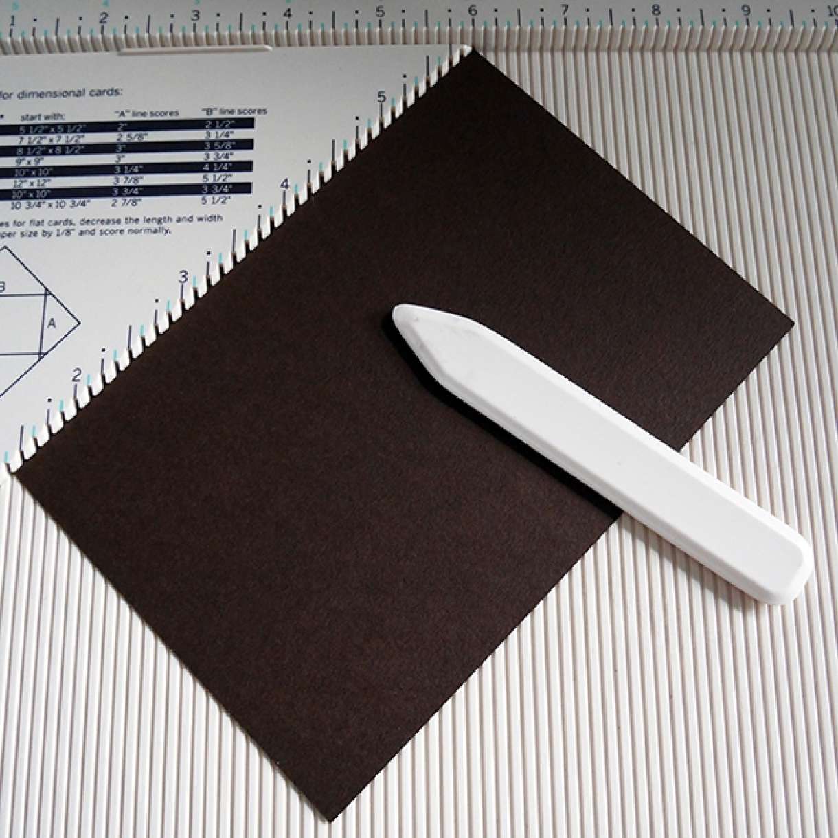


I die cut some layering panels from the Buff and Cumbria card to give even more layer and depth to the card.


To add some lace I placed some red line tape at the back of the cushioned panel and wrapped the lace around. This means you don't see any adhesive from the front, but it is secure enough to hold it in place, as long as you get the tension right.


I then started to assemble all my layers onto a buff card blank using a combination of wet glue for some, and foam tape for others.


I needed a further layer, and some more dimension, so I die cut a scalloped heart, and wrapped some rough bakers twine in brown around it at an angle. I stacked the layers of twine to give lots of dimension, and tied it in a bow to the front. This heart was the top most layer then.

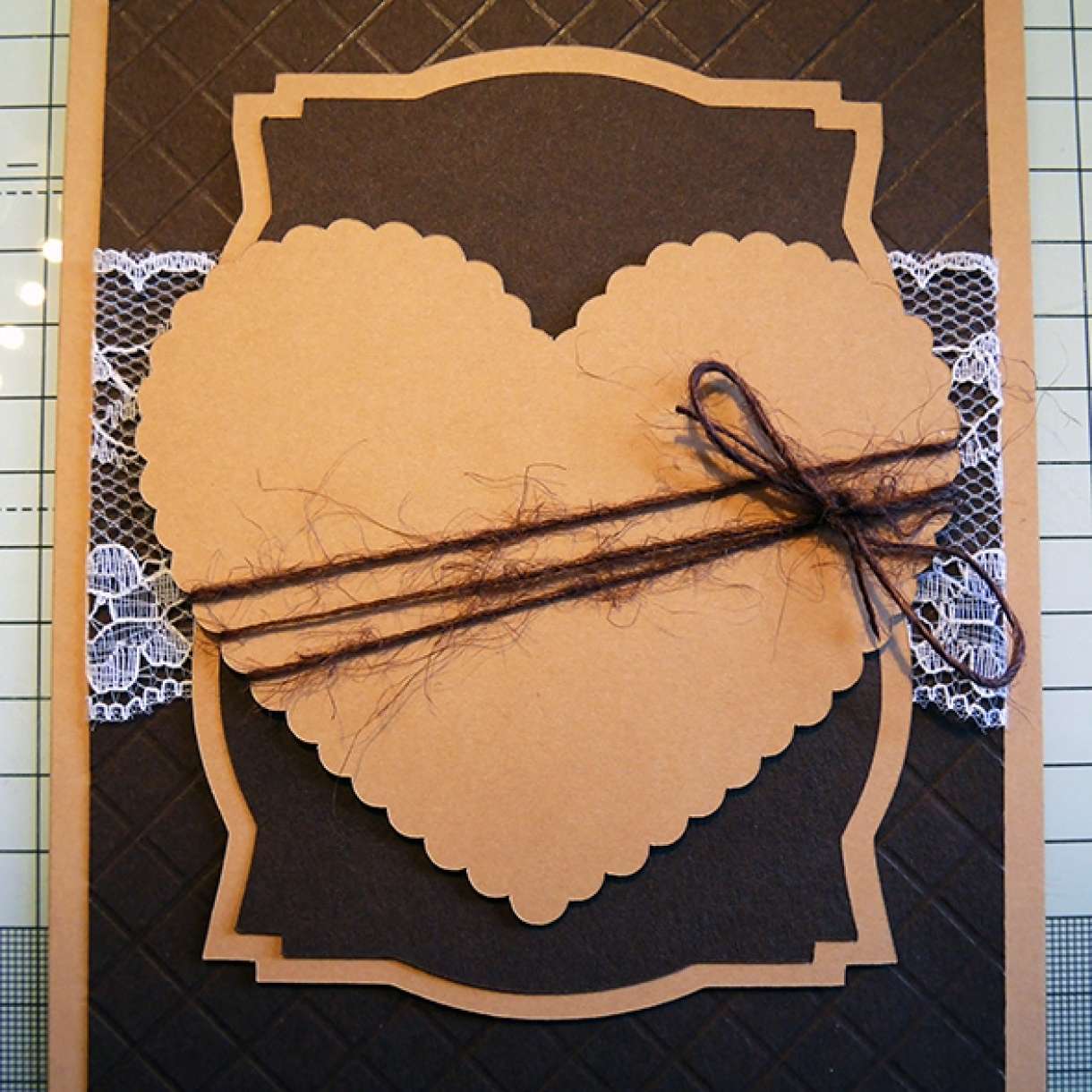
I used my digital cutting machine to cut out the silhouette of a wedding couple and the Mr & Mrs font. I used the shimmery Cuba Libre for this, because every wedding card needs some shimmer, and the Cuba Libre does it in a subtle and classy way!!

I then added the image and font to the front of the card and it was done! A neutral, subtle but hopefully classy wedding card!



Nobody has commented yet
Be the first to comment on this article by using the form below.